I’m unsure if there’s a limit to how many topics one is allowed to make but I swear this is the last one I’ll make today
I am curious now, after having gone through some of my old postcards. The cancelation stamps usually get placed in the same areas each time for USA mail I have noticed.
(I doodled rough estimation of where I usually see marks. Sometimes the bottom bar is a sticker sometimes it’s printed on?)
For Americans I was wondering if you take this into consideration when writing your message?
For other countries it annoying to receive a card from the USA and have parts that are hard to read under the cancelation?
Do you also keep in mind your country’s stamp areas or?
I have never had problems with this. So long the text stays on the left side, it is not really an issue. Sometimes the cancellation goes partly over the address, but that hardly bothers me. After all, I do know where I live. Not sure how the mailman likes that
Cards from US sometimes come with a long, white sticker (easy to peel off) with the bar code printed on it. I have always assumed it is the post office who add the stickers (?)
I am not sure what you mean by that, but yeah, the stamps goes on right up corner so I keep text on left. Our postoffice prints bar code with very light orange-ish colour you don’t even notice so the lower part of the card is not an issue. You can still see text even if they printed the bar code over it.
Until now I haven’t had problems with US cancellations covering parts so much to make them difficult to read.
I would say the opposite… US machine cancellations are light and sometimes difficult to read themselves.
I’ve found the sticker with barcode on plastic wrapped envelopes, to make possible the printing itself.
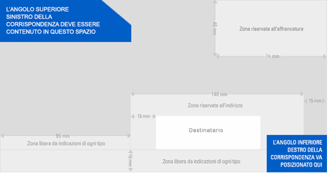
In Italy our post published this prompt to remind the distances to keep when writing address, which I try to respect (affrancatura=postage, destinatario=recipient, indirizzo=address, zona libera da indicazioni=do not write here): Standard
but I see that there’s quite tolerance: sometimes with long addresses and/or more stamps to paste, I lightly trespass the limits, as well as the order of the lines (zip code, for example) but mail arrives anyway
Yes, sending postcards from the US I avoid writing in the area at the bottom (on some postcards there’s a little box that says “do not write in this area” - I estimate where it would be when there isn’t one).
But I know that while sometimes the bar code is black, sometimes it’s orange, and like you mentioned, sometimes it’s an easily-removed sticker. So if I stray into that area a little, I don’t worry about it that much.
Sending from USA, I do try to avoid writing in the areas that will get printed over. But received cards from outside the USA often arrive with barcode sorting marks on them at the bottom. It’s usually right where people sign their names, so sometimes I can’t read the name. Here is an example from Japan that did not interfere with the name.
In Germany there are actually rules how the backside of a postcard has to look like. And I try to pay attention to the specifications. At least to the basic ones. Address on the right, stamps in the upper right corner, text on the left.
I mostly ignore the cancellation and other marking and layout rules, except that I always orient my cards horizontally instead of up-and-down, start stamp placement in the upper right corner, and put the address on the right. I use less space than DeutschePost would like for the address and more for the message, and I also sometimes decorate the “unused” address space. So far it does not seem to have caused problems.
I try to put “critical” information in places that aren’t likely to be stamped over by a cancellation and always write the Postcrossing ID number twice, usually once in red above the address (which I normally write in black) and once vertically along the left side of the card.
Many Finnish postcards have already some information on the “barcode zone” and someone adviced me not to cover the bottom of the card or write there, as it should be kept empty, but I think it doesn’t matter if it’s my writing, sticker/paper or already in the card. Obviously we don’t have such rule that it should be totally empty.
Otherwise I mostly use normal (western?) way of writing address and adhering stamps like above.
Here is how a couple of cards, that I’m about to write, look like:
If someone is interested, can read the full UPU regulations about mail sending. Pages 178/179/180 and 190/191 are related to envelopes and postcards. A lot of people should read carefully page 180 to avoid lost cards. A special attention to the relief parts, bulk stickers and other items glued on postcards may damage the sorting mail machinery and make the postcard get damage:
“3 Postcards
3.1 Postcards shall be rectangular and be made of cardboard or of paper stiff
enough not to make mail handling difficult. They shall not have projecting or raised relief parts and shall comply with the conditions laid down by the
member country or designated operator of origin.
3.2 Postcards shall bear on the front the heading “Carte postale” (Postcard)
in French or its equivalent in another language. This heading shall not be
compulsory for picture postcards.
3.3 Postcards shall be sent unenclosed, that is to say without wrapper or
envelope.
3.4 The right-hand half at least of the front shall be reserved for the address of
the addressee, for prepayment and for service instructions or labels. The
sender may make use of the back and of the left-hand half of the front.
3.5 Postcards not complying with the regulations for that category shall be
treated as letters, except when the irregularity derives only from showing
the prepayment on the back. Such cards shall be regarded as unpaid and
treated accordingly.”
I taken it into consideration basically leaves space where I estimate the barcode reader will Sprint and the spray-on cancel will print as well. Usually i use a definitive stamps and forever stamps to add up the rate of 1.20. Usually the 5 cent grapes or a ten cent pear stamp go on the corner and if I use a forever stamp on the corners, I use the flag one. But on the bottom of the definitive stamps I use the forever stamps underneath where the killer bars get sprayed.


